There are a lot of large-scale decisions that go into creating a website, such as choosing a hosting plan, settling on a theme, and so on. It can be easy to forget that more basic elements, such as color, also play a significant role in your site’s success. In fact, choosing color schemes for websites is a design step that requires careful consideration.
While few visitors will notice your website’s colors consciously (unless you go with a particularly jarring scheme), the shades you use will have an effect on people’s experience. This is largely because different colors have specific psychological effects. Because of this, you’ll want to pick hues that complement each other effectively.
In this post, we’ll discuss the importance of color when it comes to designing your WordPress site. Then we’ll walk you through the process of perfecting color schemes for websites. Let’s get started!
Why color schemes for websites matter

The smart use of complementary and contrasting colors can help your website stand out.
When building a new website, many people simply design it around whatever colors they happen to like. If what you’re creating is a simple personal blog, this approach can be fine. However, if you’re looking to accomplish a specific goal with your website, you’ll want to give color a bit more thought.
Here are just a few of the reasons why choosing color schemes for websites is an important process:
- Colors that complement and/or contrast with each other in a pleasing way improve the experience of using your site.
- Different colors have specific connotations and psychological effects. This means you can use them to help get people feeling or thinking a certain way.
- Using colors to provide deliberate contrast for your Calls To Action (CTAs) can help to increase conversions. Multiple case studies have found that certain color contrasts play a significant role in conversion increases ranging from 10% to more than 50%.
If you’re a designer or an artist, picking an effective color scheme for your website will likely be simple. However, if you’re not, chances are you aren’t certain as to what color scheme will best meet your needs. In the rest of the article, we’ll cover some important factors to keep in mind when it comes to choosing the optimal color scheme for your website.
How to choose color schemes for websites (in 3 steps)
Settling on the right color scheme doesn’t have to be a complex process. All it takes is a little research and the right tool. The following steps will walk you through the process of choosing color schemes for websites.
First, let’s address the most basic changes you can make to your WordPress site’s color scheme, using the WordPress Customizer. Visit Appearance -> Customize in your dashboard, and select the Colors tab:
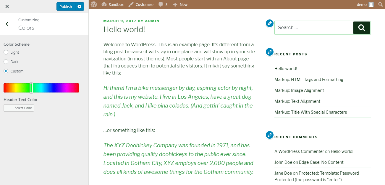
The choices here will vary depending on your theme.
We have the Twenty Seventeen theme installed right now, and we can change the basic color scheme from Light to Dark and edit the color of the header text. We can also create a custom scheme by selecting a specific color.
The ability to make these alterations quickly and easily is helpful. However, if you want more control over your site’s appearance, you’ll have to build color schemes for websites from scratch. Let’s discuss how to do that now.
Step 1: Choose the primary color for your website

A predominantly white color scheme invokes a feeling of cleanness and efficiency.
Before settling on a full color scheme, it helps to have something foundational in place. This means picking a primary color for your site – the shade that will be used most predominantly.
If you already have strong branding in place for your business or organization, it’s often best to use the primary color for your brand prominently on your website. This will help improve your brand recognition, and create consistency between your various presences both on and offline.
If you don’t have a set color to work with, however, you can choose one with the help of some color psychology. Research has shown that people have predetermined associations with specific colors. This means you can use the primary color on your site to evoke particular thoughts and feelings.
For example, here are a few of the most common colors and their associations:
- White: Sophistication, efficiency, cleanness.
- Black: Glamour, security, power.
- Blue: Trust, openness, calm.
- Green: Balance, growth, finances.
- Red: Warmth, excitement, youth.
- Violet: Romance, mystery, quality.
This means you’ll want to think carefully about the effect you want your site to have on visitors. Do you want them to feel calm and relaxed? You may want to pick a shade of blue as your primary color. If you want to attract a young audience and get them excited, on the other hand, red may be a better choice. Once you have a primary color in mind for your website, you can move on to the next task.
Step 2: Select a color scheme
Some websites can get away with using a single color for their design. Most of the time, however, you’ll want at least a few shades to work with. To make sure the colors you choose go together well, you can use a basic color scheme.
Selecting a color scheme is much easier if you have a tool to help you out. For a great example, you can check out Adobe’s color wheel tool. This site enables you to choose a type of color scheme, and find specific colors based on that scheme.
Let’s start out with Adobe’s most basic default color scheme option: Analogous. With this scheme, you get a few colors that are very similar. In Adobe’s color wheel tool, you can click on the middle selector and drag it to the primary color you choose in the previous step:
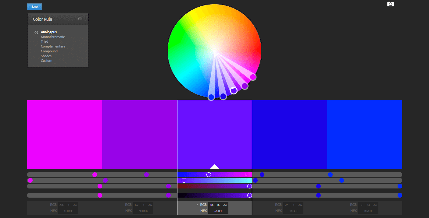
The tool will offer up four additional colors that will complement your main shade.
You can make them lighter or darker by dragging the selectors in and out. The color pallet below the wheel will also provide the specific hex codes for each color, so you can use them on your site easily.
Analogous is a useful color scheme if you want your site’s design to convey a sense of simplicity and efficiency. However, what if you want a little more ‘pop’? In that case, check out the Complementary color scheme:
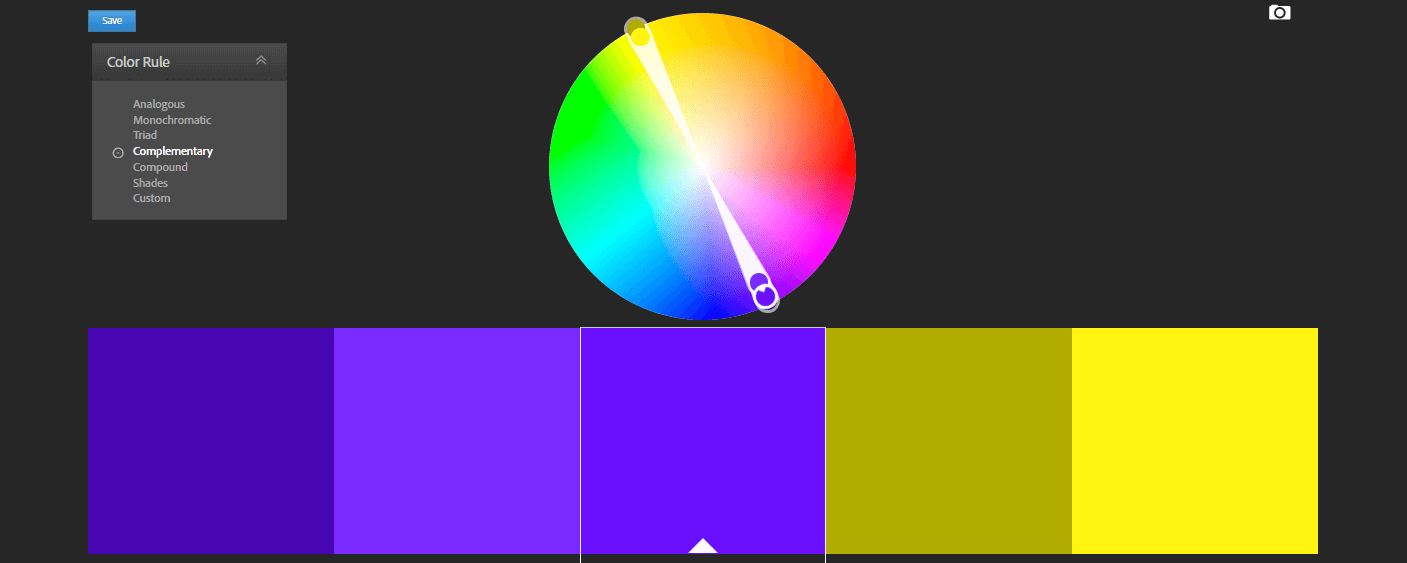
This will show you the color that’s the exact opposite of your primary shade, which is useful if you want to create sharp contrasts. For an even more extreme version of this effect, there’s the Triad color scheme:
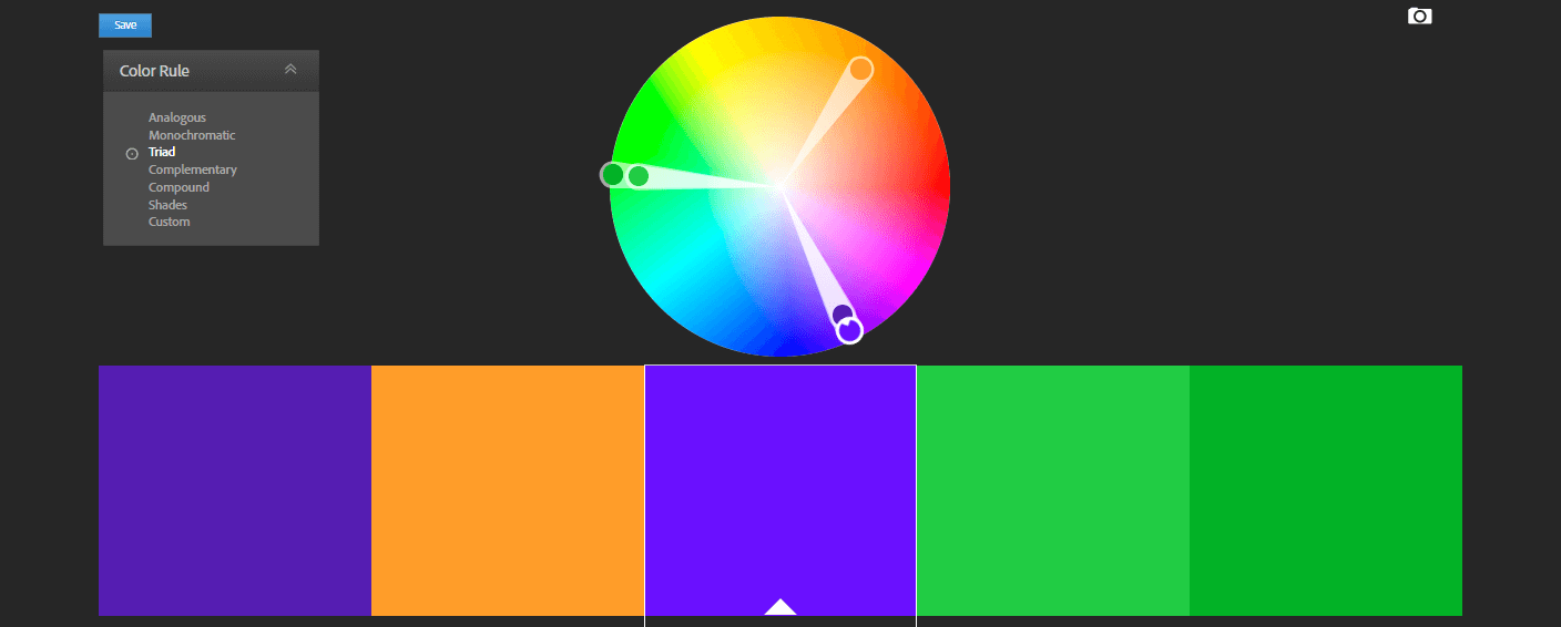
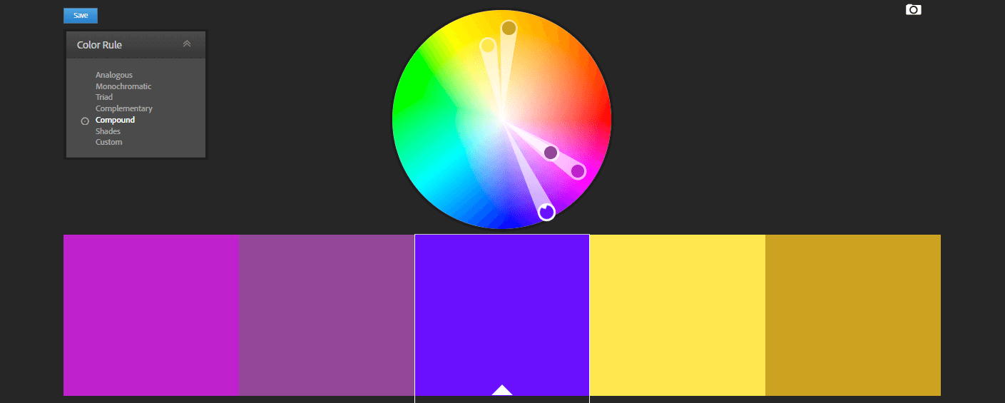
If you’re looking for some contrasting colors, but want more than two or three options to work with, the Compound color scheme is a nice middle ground:
Feel free to experiment with all the color schemes available until you get a result you like. There are also plenty of other color wheel sites you can try out. The nice thing about using this kind of tool is that, whatever colors you settle on, you’ll know they complement one another.
Step 3: Design your site using your chosen colors
Once you have a handful of colors to work with, all that’s left is to actually use them on your site. We wouldn’t want to dictate exactly how you should do this, since you’ll want your site to have its own unique design. However, there are a few guidelines you can follow to generate the most attractive results.
First, you’ll want to decide where to use your primary color. This will be the dominant shade throughout your site, so it’s best to use it for prominent elements such as your header, background, or title text.
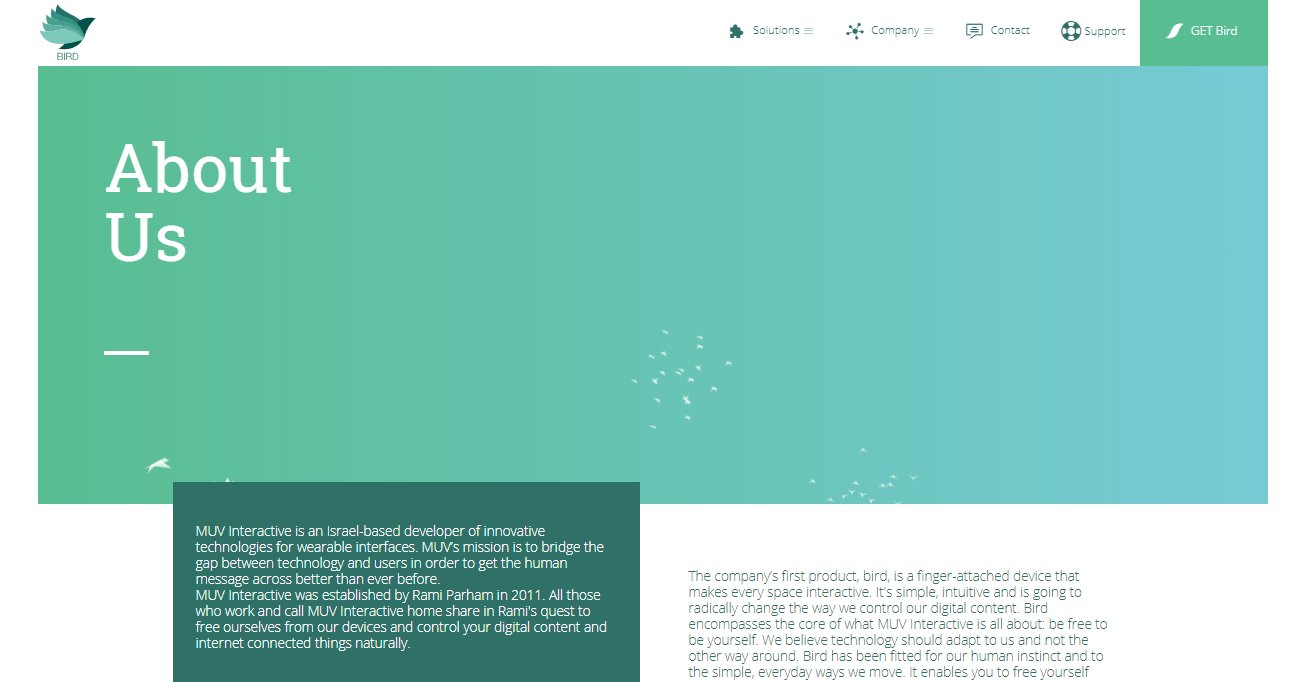
With your primary color in place, you can use complementary hues for other elements, such as menus, lower-level headings, and so on. Technology company MUV Interactive effectively uses similar shades of green and blue to create an attractive look:
Finally, don’t forget about your contrasting colors. These should be used sparingly and for a purpose – usually to highlight important CTAs. The website Mix The City demonstrates this perfectly, with a bright yellow CTA button that stands out clearly from the otherwise dark design:

There are plenty more examples of websites with stunning color schemes, which you can use as inspiration during your design process. It may take a little time and a few tries to get your colors just right, but the end result will be well worth the effort involved.
In Conclusion
The role that color plays in your website design should not be underestimated. By carefully selecting the colors you use on your website, you can influence the way visitors feel and the associations they make with your content and brand. You can even use contrasting colors to deliberately draw attention to key elements on your pages.
Related Posts

How to Fix “Briefly Unavailable for Scheduled Maintenance” Error in WordPress
WordPress added support for automatic updates in version 3.7 which allows WordPress to update itself to minor releases. A common problem when updating on shared WordPress hosting is that the update process may timeout, leaving your site in maintenance mode and inaccessible. In this article, we will show you how to fix “Briefly unavailable for scheduled maintenance” error in WordPress. Why […]
Read More
How to Fix “Are You Sure You Want to Do This” Error in WordPress
Every once in a while, you might encounter a WordPress error like error establishing database connection or memory exhausted error. Those errors are somewhat helpful because they tell you exactly what the problem is. Then there are the unhelpful errors like “Are you sure you want to do this”. The reason why this error does not provide any […]
Read More
How to Fix WordPress Login Page Refreshing and Redirecting Issue
Login issues can be caused by various different errors such as “error establishing database connection”, “internal server error” or “white screen of death”. Another type of login error is when your login page keeps refreshing and redirecting it back to the login screen. In this article we will show you how to fix the WordPress login page refreshing and […]
Read More
How to Fix the 500 Internal Server Error in WordPress
Internal server error is not specific to WordPress. It can happen with any website running on a web server. Due to the generic nature of this error, it does not tell the developer anything. Internal server error in WordPress is often caused by plugin or theme functions. Other possible causes of internal server error in […]
Read More